Well just three of them, there’s definitely more but I have always gravitated towards these for projects.

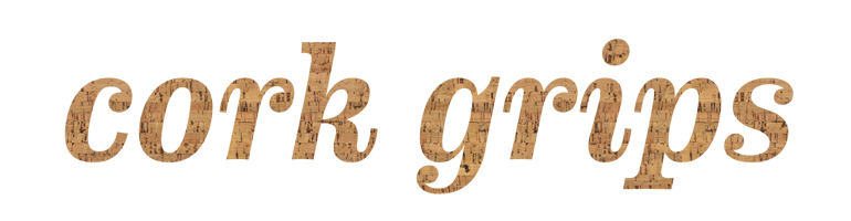
Archer by the infamous Hoefler & Frere-Jones type foundry. Available in 40 different weights, most notable for it’s use in the corkgrips banner at the top of the page you’re reading from.. Ok that might be a bit of a lie, because it was actually designed for print in Martha Stweart Living magazine.

Futura is a typeface I can never seem to get enough of, designed by a sharp German named Paul Renner who is also well known for his book The Art of Typography. Futura can be seen everyone as it is loved by many: Ikea, Volkswagen, Barbara Kruger, Wes Anderson films, Vampire Weekend, the list goes on forever. This past fall there was some drama going on because Ikea had made the switch over to Verdana (!?) and upset a lot of people… who live Futura.

Interstate takes after the all too familiar letters of highway signs and was designed by Tobias Frere-Jones of the (surprise!) Hoefler & Frere-Jones type foundry. Below is only a small sampling of the weights it comes in but I like to use the heavier weights.


